

Understanding Ten Trade in Nigeria: Concepts and Impact
📦 Explore ten trade in Nigeria: its roots, use in informal markets, impact on small businesses, and role in cross-border deals shaping local commerce today 🇳🇬
Edited By
Emily Parker
Trade charts are vital for anyone looking to navigate the Nigerian financial markets successfully. Whether you are trading stocks on the Nigerian Exchange (NGX), forex pairs involving the naira, or commodities like oil and agricultural products, understanding how to read and interpret charts makes the difference between guessing and making informed decisions.
Charts provide a visual snapshot of price movement over time. Nigerian traders benefit by tracking patterns that reveal potential entry and exit points in trading or investment. For instance, seeing the historical price of Dangote Cement shares over the past six months can help you assess when to buy or sell.
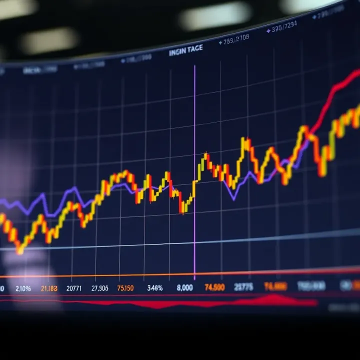
The power of trade charts lies not just in showing where prices have been, but signalling where they could go next.
Common types of charts used in Nigeria include:
Line charts: Simple plots connecting closing prices. Useful for a broad outlook.
Bar charts: Show open, high, low, and close (OHLC) for each trading day.
Candlestick charts: Similar to bar charts but with a more vivid display of the price action using colour-coded segments.
Each chart type suits different trading styles, from long-term investing to intraday trading.
Key to making the most of charts is recognising trends and patterns. For example, a steady upward slope in the price of an equity like GTBank suggests a bullish trend. Conversely, a sharp drop with high volume might warn of a correction or sell-off.
Nigerian traders must also pay attention to volumes; high trading volume often confirms the strength of a price move. For example, a rise in Nigerian government bond prices accompanied by growing volume indicates solid investor interest.
As you start exploring trade charts, remember to apply indicators like Moving Averages, Relative Strength Index (RSI), or Bollinger Bands. These tools add depth to chart analysis, showing momentum, overbought or oversold conditions, and potential volatility respectively.
Reading trade charts is a skill perfected over time—best done by practising with real market data from platforms such as the NGX trading portal, or brokerage platforms like Meristem Securities or CardinalStone. Start by observing daily price swings and gradually incorporate different indicators into your analysis.
Understanding these fundamentals sets the stage for smarter, data-driven trading decisions that suit the unique nuances of Nigeria’s financial markets.
Trade charts are visual tools that track the price movements of assets like stocks, currencies, or commodities over time. They help traders and investors in Nigeria monitor market behaviour, spot trends, and make decisions based on data rather than guesswork. By presenting raw price changes in graphical form, trade charts make it easier to understand complex market shifts at a glance.
For example, a trader watching shares listed on the Nigerian Exchange Group (NGX) might use a chart to see how a stock's price moves during the day or over several months. This visual aid is crucial because it condenses huge amounts of information into clear, understandable formats.
Trade charts serve to display the historical price movements and trading volumes of assets. Their primary aim is to give traders a straightforward way to analyse market patterns rather than relying on text or spreadsheets filled with numbers. Common types include line charts, bar charts, and candlestick charts, each offering a different level of detail.
Using these charts, a Nigerian forex trader looking at the naira-dollar exchange rate might decide whether to buy or sell based on the observed price patterns over time. Through this, charts act as navigational tools guiding traders through volatile markets.
Charting has been part of trading since the late 19th century when Charles Dow developed fundamental theories about market trends. Since then, the method evolved with the introduction of more sophisticated chart types and technical indicators.
In Nigeria, as financial markets opened up and digital platforms became accessible, trade charts gained more prominence, especially with the rise of retail investors using online brokers. This progression means modern Nigerian traders can leverage years of market data faster and with better insights than their predecessors.
Charts turn price action into clear visuals, showing how an asset’s value has changed over specific periods. This feature helps traders quickly grasp whether prices are moving up, down, or sideways without digging into confusing numbers.
Consider a trader monitoring the price of oil on the international market, which impacts Nigeria’s economy. Charts allow them to see sudden spikes or drops instantly and react appropriately, such as adjusting their investment portfolio or hedging risks.
Trade charts highlight trends by displaying price directions and patterns. Trends—whether bullish or bearish—give traders clues on when to enter or exit trades.
For example, if the chart of a blue-chip company listed on NGX shows consistent higher highs and higher lows over weeks, it signals an uptrend. A trader recognising this might choose to buy shares early to maximise profit potential before the trend reverses.
Using trade charts supports risk management by helping traders spot support and resistance levels, price breakouts, or reversals. These points guide them on where to place stop-loss orders to limit possible losses.
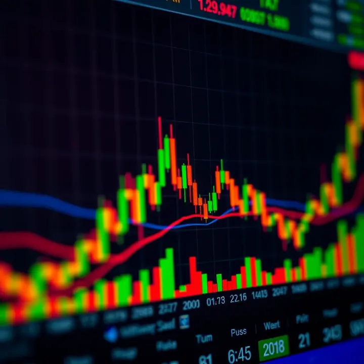
Imagine a Nigerian commodities trader dealing in maize prices. The trade chart can show when prices hit a resistance level several times but don’t break through. Knowing this, the trader might avoid entering a buy position until the price decisively moves past that resistance, reducing the risk of a bad trade.
Effective use of trade charts can make the difference between winning and losing in trading. They put control in the hands of traders by grounding decisions in observable market behaviour rather than speculation.
In essence, understanding trade charts is a practical skill every Nigerian trader needs to sharpen. They turn the noise of the markets into clear signals, helping users trade more confidently and with better foresight.
Trade charts come in various forms, but among Nigerian traders, three stand out for their practicality and ease of use: line charts, bar charts, and candlestick charts. Each type serves different needs, offering unique insights depending on trading objectives and market conditions. Understanding these common charts helps traders analyse price movements and make smarter decisions in markets such as the Nigerian Stock Exchange (NSE) or the forex market.
Line charts are the simplest form of trade charts. They plot closing prices over a selected period, connecting these points with a continuous line. This simplicity means they quickly show the overall direction of a stock or currency pair without clutter. For example, a trader tracking the share price of MTN Nigeria over six months can see the general trend up or down at a glance.
Because of their simplicity, line charts are excellent for beginners or when you need a quick overview. They work well in volatile markets where too much detail might confuse a trader. That said, since line charts only show closing prices, they ignore the day's price swings, which might hide important intraday patterns.
Bar charts offer more detail by showing four price points for each period: open, high, low, and close—abbreviated as OHLC. This gives traders insight into price ranges and volatility within the period. For instance, a bar chart of Nigerian crude oil futures would reveal how far prices fluctuated during the day, not just where they ended.
Compared to line charts, bar charts provide a richer picture. They help traders identify reversals or strong price moves by highlighting ranges and gaps. Unlike line charts, bar charts allow traders to track buying and selling pressure more closely, aiding more informed entry and exit decisions.
Candlestick charts are similar to bar charts but use coloured bodies and wicks to represent OHLC data, making them visually more intuitive. The body shows the difference between open and close prices, while the wicks (or shadows) display highs and lows. A green (or white) candle means the price closed higher than it opened, while red (or black) means the reverse.
Common candlestick patterns, such as the "hammer" or "doji," signal potential market reversals or indecision. These patterns are valuable in Nigerian markets to time buys or sells, especially in stocks like Dangote Cement or in forex pairs like USD/NGN.
Their visual clarity explains why candlestick charts have taken hold in Nigerian trading circles. They combine detailed price information with clear signals, making them suited for traders who need quick insights without analysing complex data.
For Nigerian traders, selecting the right chart type depends on experience and trading style, but mastering these common types forms a solid foundation for effective market analysis.
Reading and interpreting trade charts accurately forms the backbone of successful trading, especially in markets such as Nigeria’s, where factors like naira volatility and intermittent market news impact prices daily. Trade charts provide visual clues about market behaviour that numbers alone cannot easily show. Understanding their subtle messages helps traders decide when to enter or exit trades, manage risks, and avoid costly mistakes.
A crucial step in reading trade charts is recognising how different time frames shape your view of the market. Short-term charts, like 5-minute or 15-minute intervals, zoom in on recent price action. They suit traders who prefer quick trades, such as day traders or scalpers operating on the NSE or forex markets. For example, a forex trader relying on 15-minute charts can spot entry points during volatile sessions, like the London open.
On the flip side, long-term charts—daily, weekly, or even monthly—reflect broader market trends. Investors aiming at steady growth over months use these charts to avoid reacting to short-lived price swings triggered by occasional news from, say, the Central Bank of Nigeria (CBN) or fuel supply disruptions. These charts help in understanding bigger cycles and support sound portfolio decisions.
Choosing the right time frame depends heavily on your trading style. Active traders need shorter time frames for rapid decisions, while long-term investors focus on charts reflecting extensive price history to gauge overall health. It’s common for smart traders to use multiple time frames: zooming out for trend direction on a weekly chart and zooming in to optimise entry points on daily or hourly charts.
Trend lines and support/resistance levels are fundamental tools in reading charts. A trend line connects consecutive highs in a downtrend or lows in an uptrend, showing the general price direction. For example, in Nigerian stocks like Dangote Cement, an upward trend line can indicate persistent buying interest, signalling potential profit opportunities.
Support levels mark prices where buying typically strengthens, preventing the price from falling further. Resistance levels are the opposite—the prices where selling pressure might stall upward movement. Recognising these allows traders to plan buy and sell positions with more confidence.
Chart patterns add another layer of insight. Common shapes like "head and shoulders," "double tops," or "flags" suggest what market participants might do next. For Nigerian markets, spotting a "cup and handle" pattern on an NSE listed stock’s chart might hint at a bullish breakout, encouraging more buyers to jump in. Knowing these patterns helps traders anticipate moves rather than simply react.
Successfully interpreting trade charts is a skill that combines listening to price action through trends and patterns while choosing the right time frame for your unique strategy.
Master these elements, and you’ll be better equipped to navigate Nigeria's dynamic markets, whether dealing in stocks, forex, or commodities.
Trade charts alone display price movements but combining them with key indicators helps you understand the market deeper. These tools simplify complex data, highlighting trends or warning of reversals, which is especially useful in the often volatile Nigerian market environment. Using indicators thoughtfully sharpens your trading decisions, whether you’re dealing with NSE shares, forex pairs like USD/NGN, or commodities such as crude oil.
Simple and exponential moving averages offer a smoothed view of price data, helping filter out the noise of daily fluctuations. The Simple Moving Average (SMA) calculates the average price over a set number of periods, giving equal weight to each. For example, a 20-day SMA tracks the average closing price over the last 20 days, smoothing short-term ups and downs. The Exponential Moving Average (EMA), by contrast, gives more weight to recent prices, making it more responsive to new information.
Using moving averages to spot trends is crucial for many traders. When the price stays above the moving average, it suggests a bullish trend; below it signals bearishness. Nigerian traders often watch the crossover of short-term and long-term moving averages—like the 50-day crossing over the 200-day EMA—as a signal to buy or sell. This helps avoid rushing into the market during short-lived price swings common in local stocks or forex pairs.
Understanding volume bars provides insight into market interest behind price movements. Volume bars appear at the bottom of trade charts, showing how many units of an asset changed hands. A high volume spike during a price rise in MTN Nigeria shares, for example, suggests strong buyer interest, reinforcing the price momentum.
Volume’s role in confirming price moves cannot be overstated. Price movements with low volume often lack conviction and can easily reverse. For instance, if Nigerian crude oil prices break a resistance level on heavy trade volume, it indicates sustained interest, making the breakout more reliable. Conversely, a jump with little volume calls for caution.
Relative Strength Index (RSI) measures momentum by comparing average gains to losses over a specified period, usually 14 days. An RSI above 70 warns that the asset, say Airtel Nigeria shares, might be overbought and prone to a price pullback. RSI below 30 suggests oversold conditions where a rebound could be near.
Moving Average Convergence Divergence (MACD) tracks the relationship between two EMAs (often 12-day and 26-day) to signal shifts in momentum. When the MACD line crosses above the signal line, it’s a bullish sign; a crossover below hints at bearishness. Nigerian forex traders, especially in the USD/NGN market, find MACD helpful to time entries and exits amid volatile currency shifts.
Indicators alone don’t guarantee success, but when combined with trade charts and local market knowledge, they sharpen your view and reduce costly mistakes.
Trade charts are not just theoretical tools but practical instruments that Nigerian traders use to make real-time decisions affecting their investments. Understanding how to apply charts effectively in local markets can boost your confidence in buying or selling shares or currencies. However, traders must watch out for common errors that could wipe out gains or deepen losses. This section sheds light on these practical aspects to help you trade smarter.
Nigeria’s stock exchange, now known as the Nigerian Exchange Group (NGX), features a variety of equities ranging from blue-chip companies like Dangote Cement to small and mid-cap stocks. Using trade charts for these equities helps traders spot price trends, volume spikes, and potential entry or exit points. For example, a trader observing the candlestick patterns on Dangote Cement’s chart may identify bullish reversal signals during periods of price stagnation. Coupled with moving averages, this approach makes it easier to time trades and capitalise on market movements.
Nigerian traders also benefit from understanding sectoral trends. For instance, during petrol subsidy removal talks, energy sector stocks may react sharply, which charts will reflect as increased volatility. Keeping an eye on these signals enhances your ability to navigate the NSE’s dynamic environment.
Foreign exchange and commodities like crude oil play a massive role in Nigeria’s economy. Naira-dollar exchange rates and Brent crude prices are closely watched by investors and businesses alike. Applying trade charts to forex pairs such as USD/NGN or commodities like crude oil can reveal momentum shifts and support/resistance levels critical for decision-making.
For instance, if the Naira weakens sharply against the dollar, this may show on forex charts as a downtrend, signalling importers to act fast before further depreciation. Similarly, fluctuations in crude oil prices seen on charts impact Nigerian government revenue expectations, affecting stock market sentiment. Traders who monitor these charts regularly are better positioned to anticipate market reactions related to Nigeria’s external reserves and global oil demand.
Many beginners fall into the trap of trusting a single technical indicator excessively, such as only using the Relative Strength Index (RSI) or moving averages. While indicators offer useful clues, relying on just one can cause misleading signals, especially in volatile Nigerian markets affected by sudden policy shifts or geopolitical events.
For example, RSI might show that a stock is oversold, prompting some to buy, but without confirming volume or trend indicators, this decision might backfire if the price continues to drop. Smart traders combine multiple indicators with price action and market context to avoid false signals and improve trade accuracy.
Charts tell part of the story; fundamentals fill in the rest. Nigerian markets are often influenced by macroeconomic factors—CBN policies, inflation rates, fuel price adjustments, and political developments. Ignoring these while focusing solely on charts can lead to missed contexts.
Take, for example, a company delivering strong quarterly results but facing a nationwide power crisis severely affecting operations. Its share price might trend down despite good charts because of the broader challenge. Seasoned traders integrate fundamental analysis with chart reading to make holistic decisions.
Jumping onto a rising stock or forex pair just because it’s moving upwards can be tempting but risky. This trend chasing often leads to buying at market tops, resulting in losses when a reversal or correction hits.
Instead, Nigerian traders should wait for confirmation signals, like a bounce off a support level or a breakout with strong volume, before committing funds. Patience and discipline in following chart signals prevent premature entries driven by fear of missing out (FOMO).
Effective use of trade charts requires a balanced approach: blend chart analysis with market realities and avoid common pitfalls to protect your investment capital.
By understanding the practical uses of trade charts in Nigerian markets and steering clear of these mistakes, traders and investors can improve their chances of success significantly.
📦 Explore ten trade in Nigeria: its roots, use in informal markets, impact on small businesses, and role in cross-border deals shaping local commerce today 🇳🇬

📲 Discover how trade apps transform buying and selling in Nigeria! Learn key features, security tips, and top platforms to trade safely across borders with ease.

Explore app trade markets, methods, & risks in Nigeria's digital space 📱 Learn how apps are bought, sold, legal points, & growing opportunities.

📊 Explore derivative trading in Nigeria: learn how contracts linked to assets offer chances for hedging, speculation, risk control, with practical tips for investors.
Based on 14 reviews